Banners play a crucial role in online advertising. A well-designed banner can grab the attention of potential customers, display your brand, and increase conversions.

However, creating a successful banner is not always easy. There are numerous factors to consider, like size, color, and message. This article provides the do’s and don’ts for perfect banner design to make it easy for you to create impactful banners.
Do: Keep It Simple
Simplicity is key when it comes to banner design ideas. Simple banners are easy to read and understand without any extra information. Focus on the most critical elements when designing a banner template, such as your brand logo, tagline, and call-to-action.
Do: Use High-Quality Images
The images in your banner should be high-quality, easy on the eyes, and relevant to your message. Use bright, clear, and straightforward images. If possible, choose unique and eye-catching images to be able to create cool banner designs.
Do: Use a Strong Color Palette

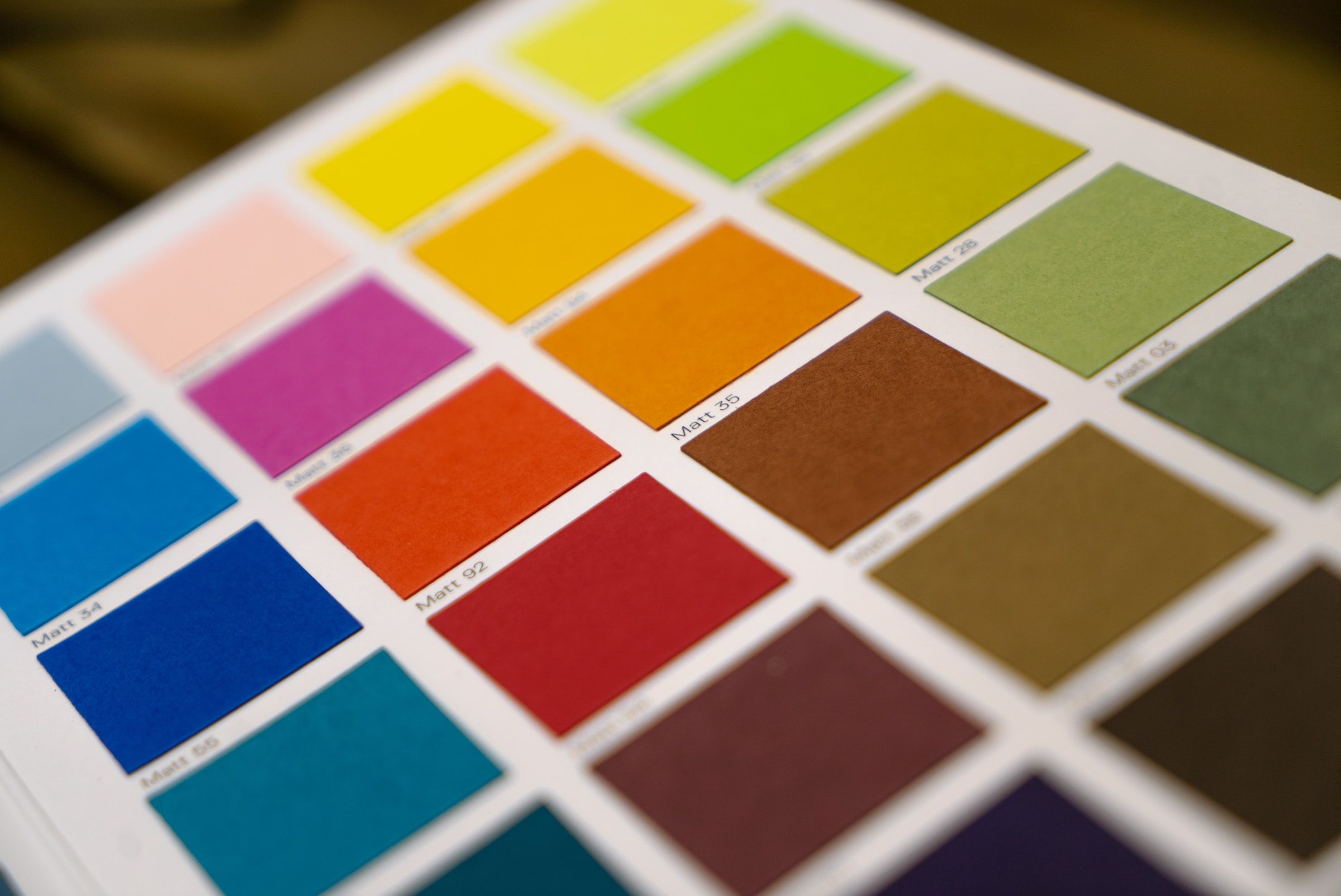
Colors have a significant impact on banner designing. Choose a color palette that represents your brand and attracts your target audience. Apply the color theory so you can learn how to use contrasting colors to make your banner more noticeable.
Do: Include a Call-to-Action
Your banner must have a clear call to action, such as “click here” or “learn more.” This will increase conversions and encourage people to take action.
Do: Make It Mobile-Friendly
Most people view banners on their mobile devices, so it’s crucial to ensure that your banner is mobile-friendly. Make sure it is easy to read on a small screen and that all essential elements are visible.
Don’t: Use a Crowded Design
Crowded banners are difficult to read and can be overwhelming. Avoid using too many images, text, or colors in your banner. Keep your design simple and clean, focusing on the most crucial elements.
Don’t: Use Low-Quality Images
Low-quality images can hurt your brand and make your banner appear unprofessional. Avoid blurry or pixelated images, and ensure that all images are high-quality and relevant to your message.
Don’t: Use Unreadable Text
The text in your banner should be easy to read. Avoid small font sizes and choose a font that is legible and consistent with your brand.
Don’t: Neglect the Size

The size of your banner is important. It should be large enough to be noticeable but not so large that it becomes overwhelming. Ensure that your banner is optimized for the platform you are using and visible on all devices.
Don’t: Overuse Animation
Animation can make your banner more engaging, but use it as little as you can. Overuse of animation can be distracting and take away from your banner’s message.
Simple Banner Design Do’s and Don’ts
Banner design can be a complex process, but with these do’s and don’ts, you can create banners that stand out and achieve your goals. Keep it simple, use high-quality images, and have a clear call to action. Remember to keep all the do’s, and the don’t’s as well in mind.
With these tips, you will be able to create a banner design that is going to help you stand out and catch the attention of audiences. So, go on and let those creative juices flow; create a well-designed banner today!
For more tips and guides, visit our blog site today!

